


Working on this point-and-click escape game, I served as a bridge between design, narrative and production. My efforts went into UI/UX, level designs and monetization strategies.
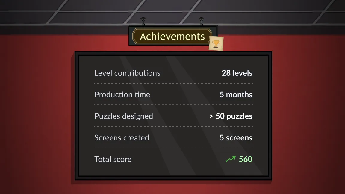
By contributing to more than 28 levels, from concepting flows to Figma high-fi prototypes, I focused on creating various rooms players could solve daily.
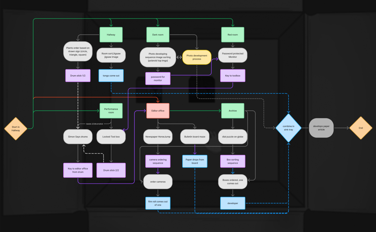
I mapped each player journey using FigJam and focusing on the puzzle's dependencies between rooms and days.
Basing my design on daily level releases, I concepted a loop where players gather puzzle items throughout the week to unlock a final, secret room on the last day.
To engage players and encourage constant logins, I integrated story beats across the week. By referencing previous days and seeding clues for future ones, I created a comprehensive world.
Focusing on long-term engagement, I prototyped a calendar system that tracked completion times and missed days.
I designed an interface that clearly communicates how players can unlock upcoming levels by completing any missed content.
This completionist economy will help maintain a steady daily active user count.
As The Red Room will be developed using HTML5, I choose Figma to prototype simple point-and-click interactions.
I implemented each flow using variable types and complex conditions. This framework helped the team test level logic and asset integration before engine implementation started.
To keep the experience fresh, I designed a wide variety of puzzles:
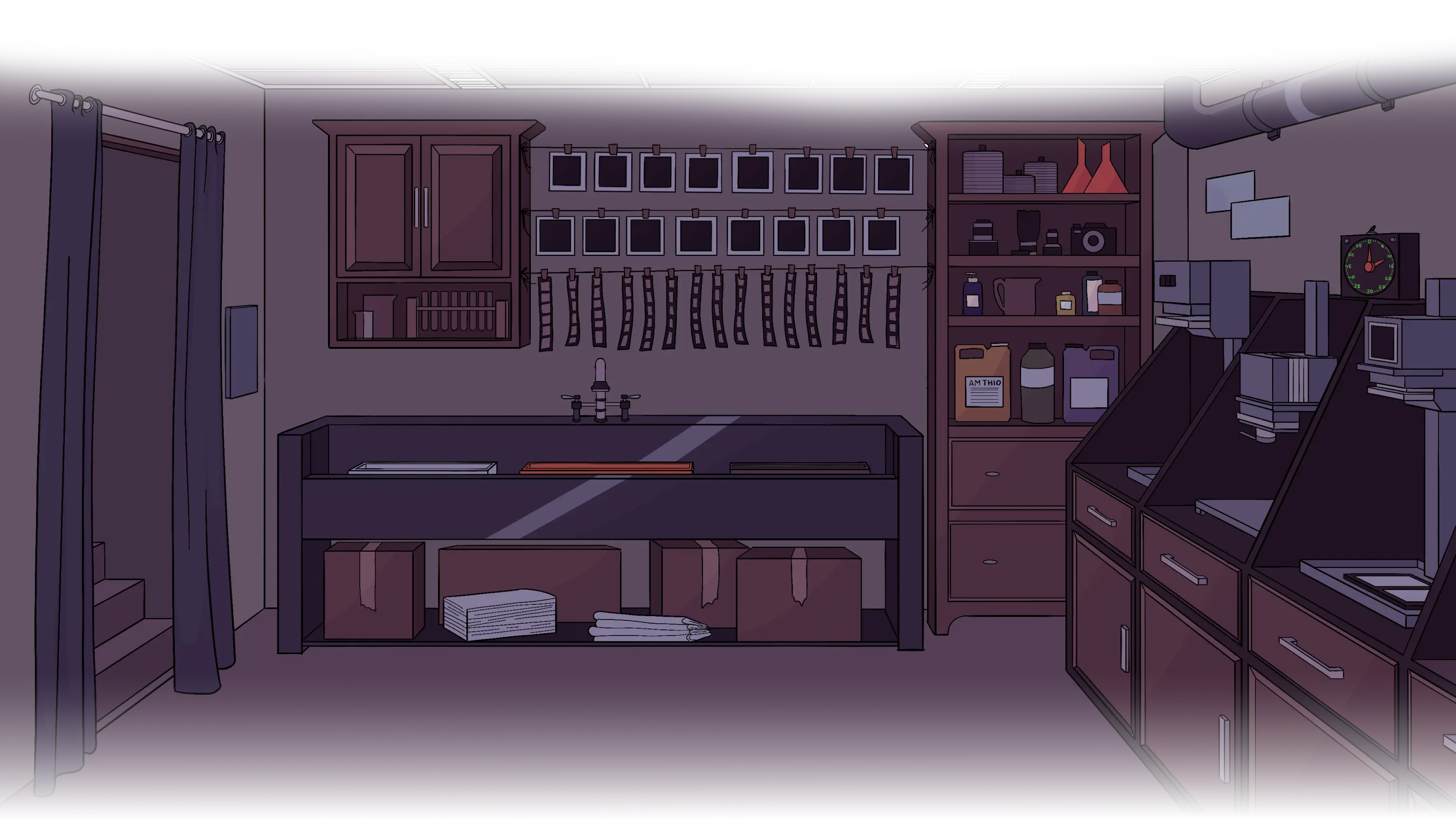
To contextualize the puzzles, I analyzed each game environment and created a list of objects that were versatile enough for designing different challenges.
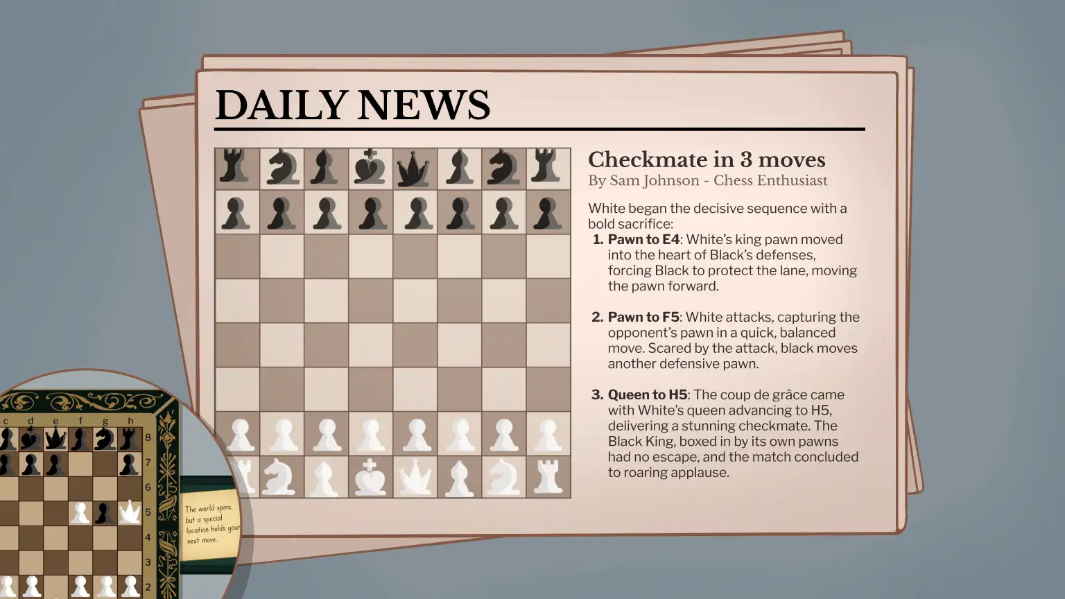
I used screens or newspapers as adaptable surfaces, adding word-based puzzles or sudoku grids. Following this approach, I reused assets while still creating distinct puzzles.
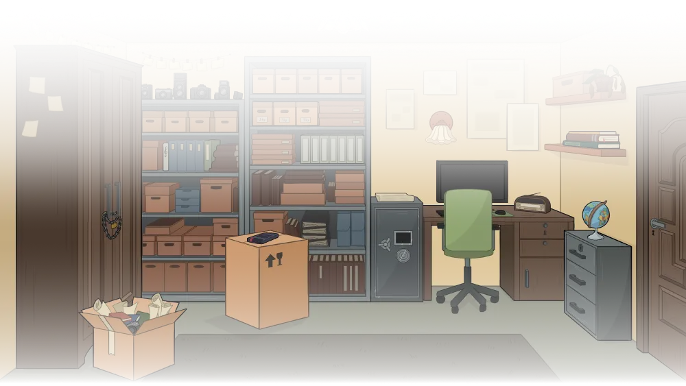
Focusing on environmental storytelling, I concepted each room to have interactive elements that aided puzzle creation:


I contextualized the main menu by styling it as a classic investigation corkboard, using red pins and string to highlight the interactable buttons.
For visual consistency, I used existing screen assets to showcase the other pages, while applying a design similar to an office sign to the back button.
To maintain immersion, when the player navigates in-between screens, I implemented sliding transitions that mimics moving through the space.
Going for a minimalist approach, I designed a compacted drop-down interaction for the inventory. This way, I avoided cluttering the clickable play area.
I used a thematical briefcase icon that would open and close. I added a red button to improve player familiarity, as testers found closing the dropdown unclear.
To support the game’s ad-based economy, I designed a rewarding and accessible hint button.
By adding a pulsing animation and opting for a green background, I drew player's attention and encouraged a positive interaction.
I placed the main menu button near the inventory, allowing players to easily pause their game.
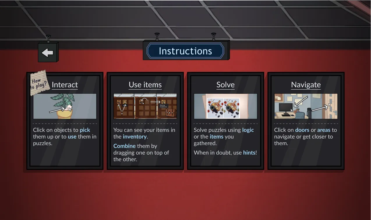
For the focused screens, I added a back arrow in the upper left. To maintain the general theme, I used a paper-like background.
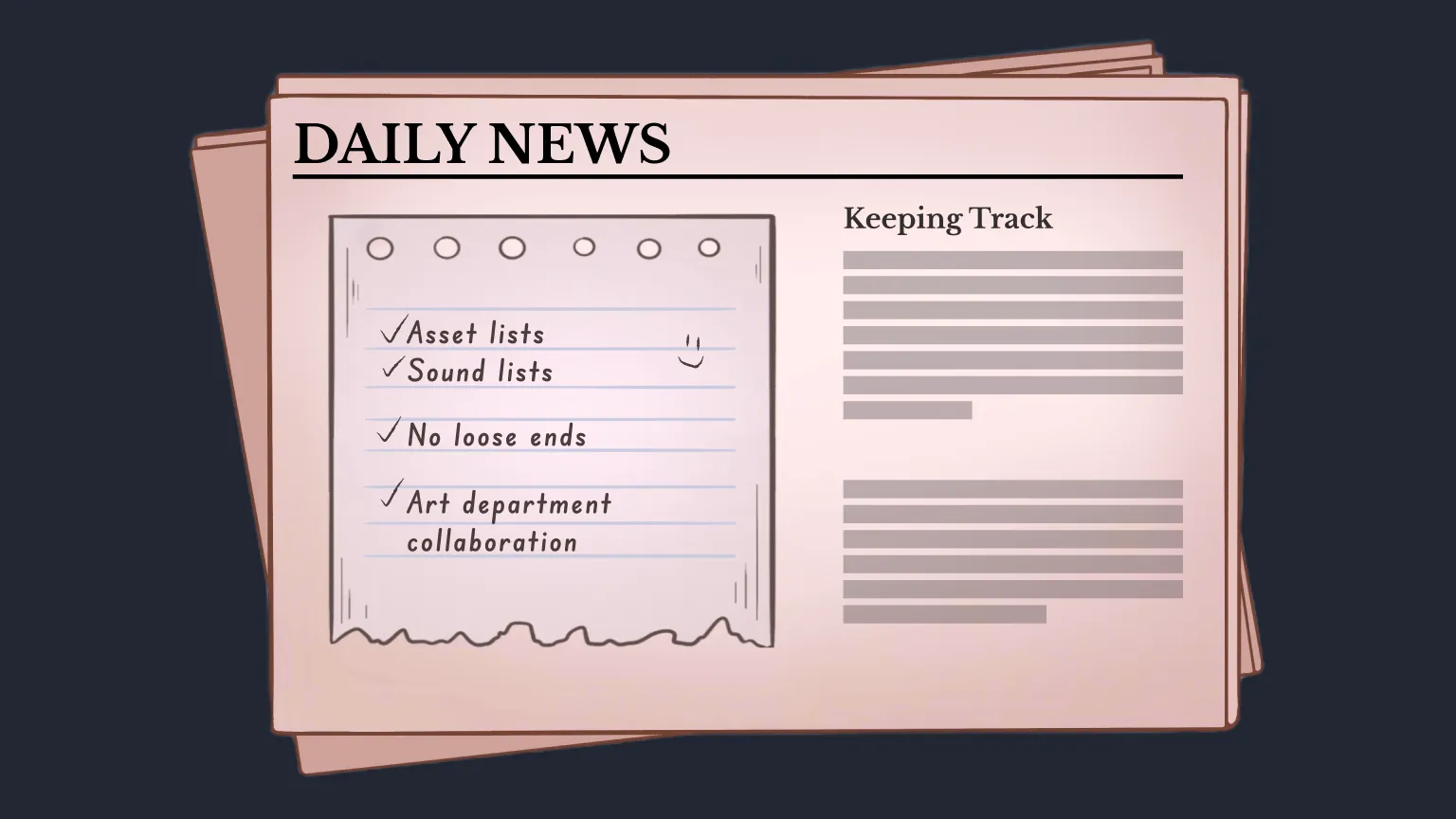
As the main designer on this project, I balanced organization tasks with my design responsibilities, training my time management skills.
Another key aspect was constantly collaborating with the other departments. This helped me and the team align on the deliverables and creating comprehensive asset lists.
Figma’s prototyping limitations made designing layered puzzles a challenge. In these cases, it would have been faster for me to directly implement the logic into engine.